Monster Hunter Wilds Magazine
Services
Illustration
Typography
Editorial Design
Role
Illustrator
Graphic Designer
Overview
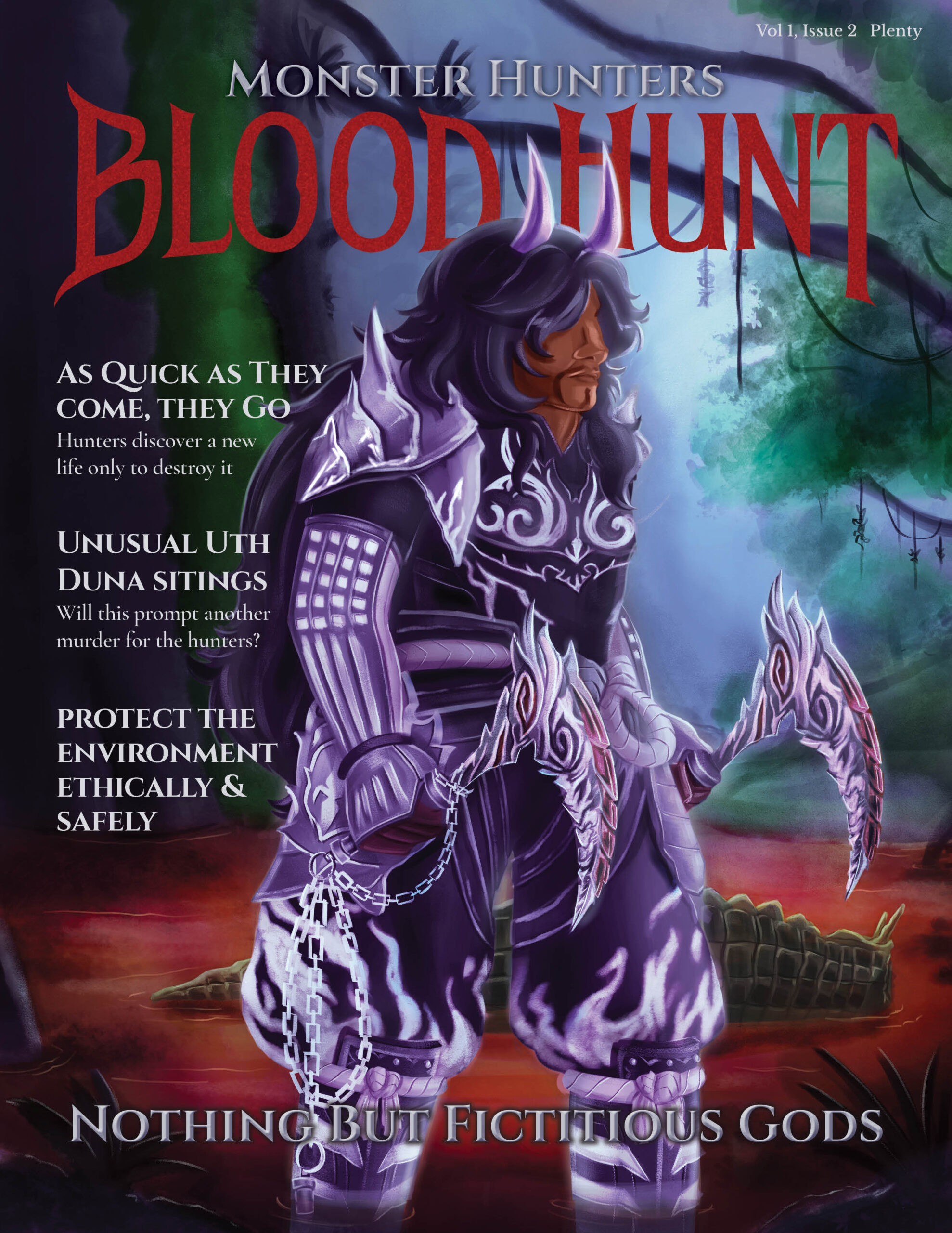
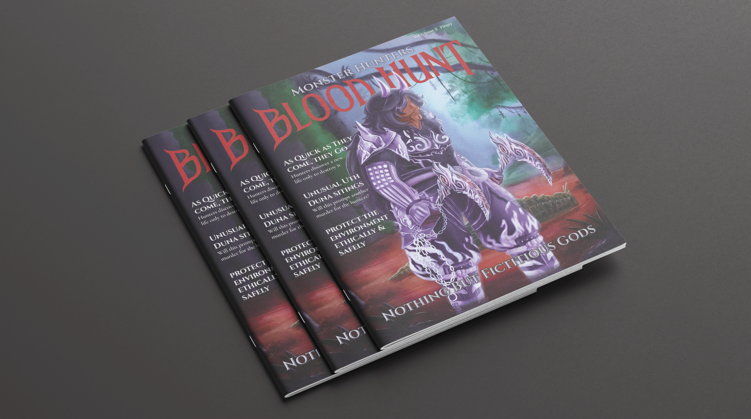
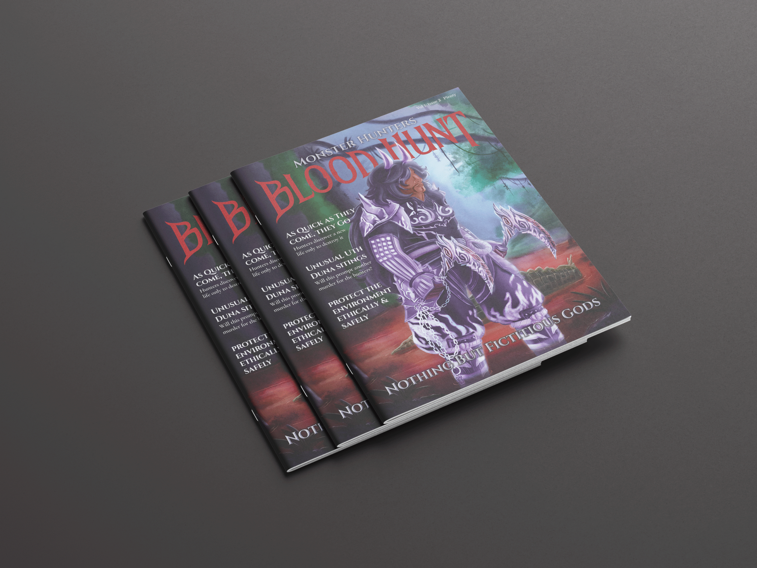
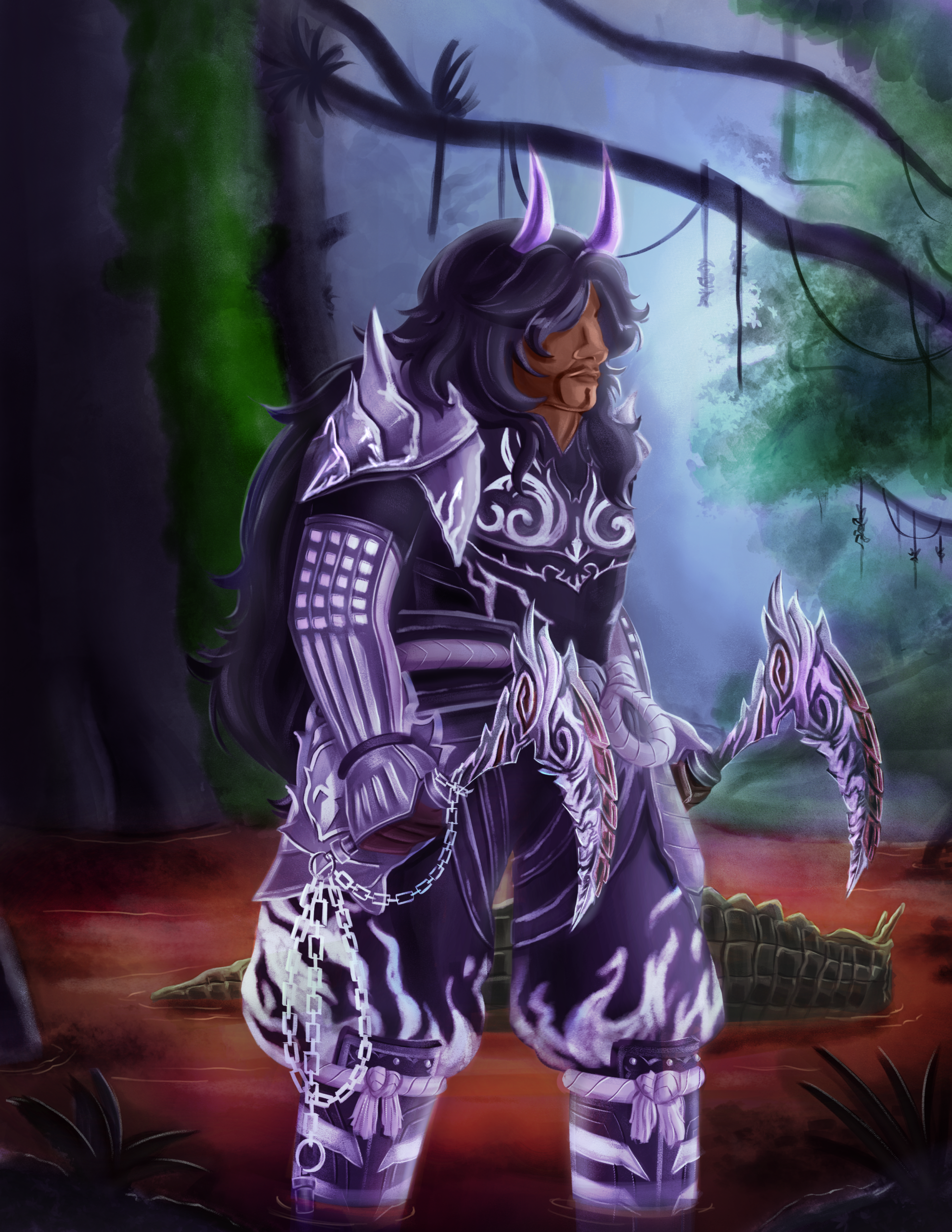
It’s important to keep the magazine’s details to evoke consistency and connection with the audience. For this magazine, I had to have a color name in the masthead that drives the theme for the cover and the spread. I decided to make the magazine’s theme about Monster Hunter, a role-playing video game series by Capcom about hunters fighting various monsters to protect the ecosystem. The magazine focuses on Monster Hunter Wilds and challenges the idea of people seeing hunters as the bad guy. This project took three weeks to complete, and with review from a director and Hunters in the community, they agree it is a fun interpretation of the world while staying true to the details and depictions.
Results
This project was successful in keeping the color for the masthead and paying homage to the game series while inputting my design language. People familiar with the Monster Hunter series were happy with the accuracy and details throughout the spread while challenging the main premise of the game’s core theme.
Thumbnails & Mockups
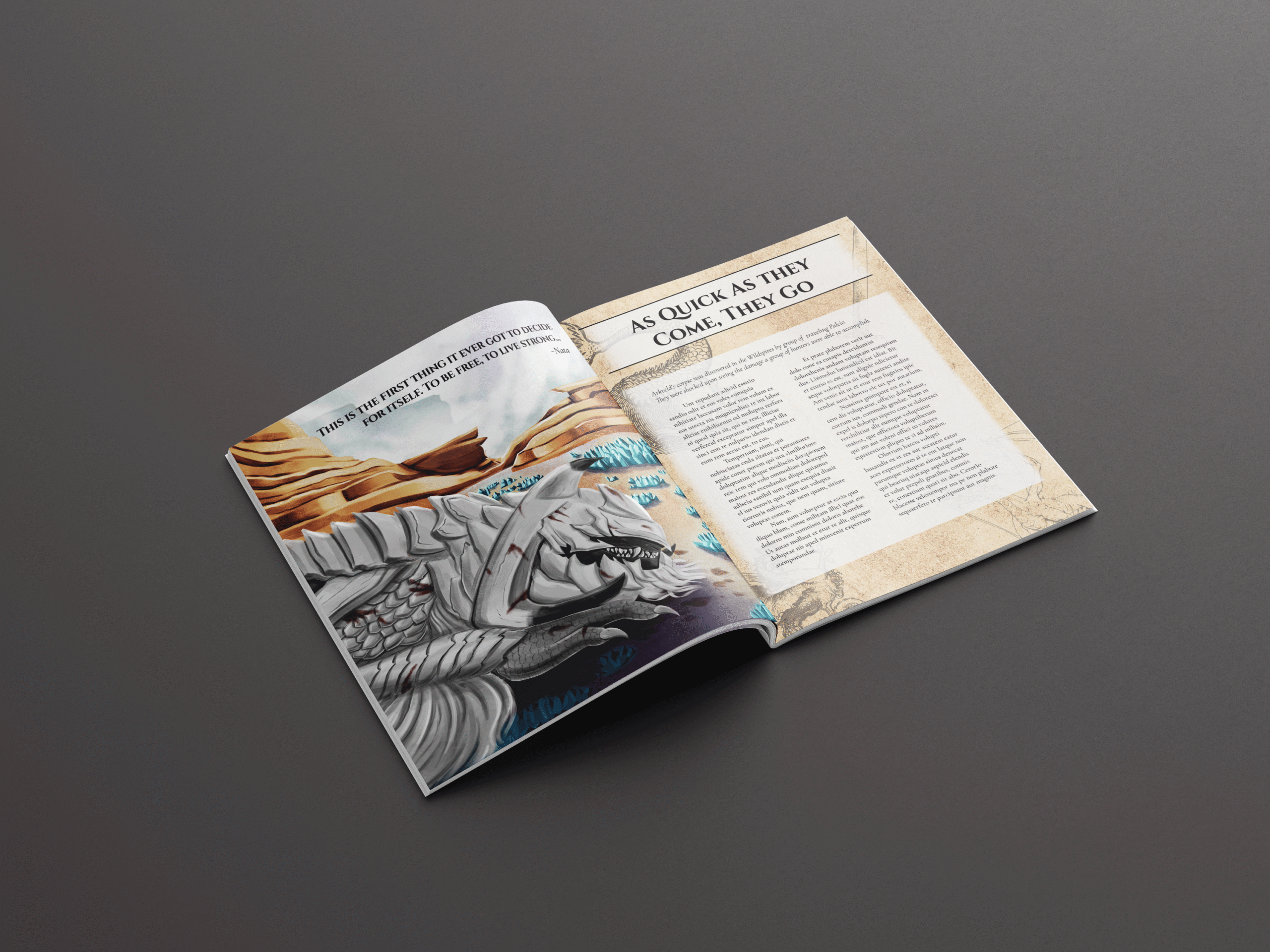
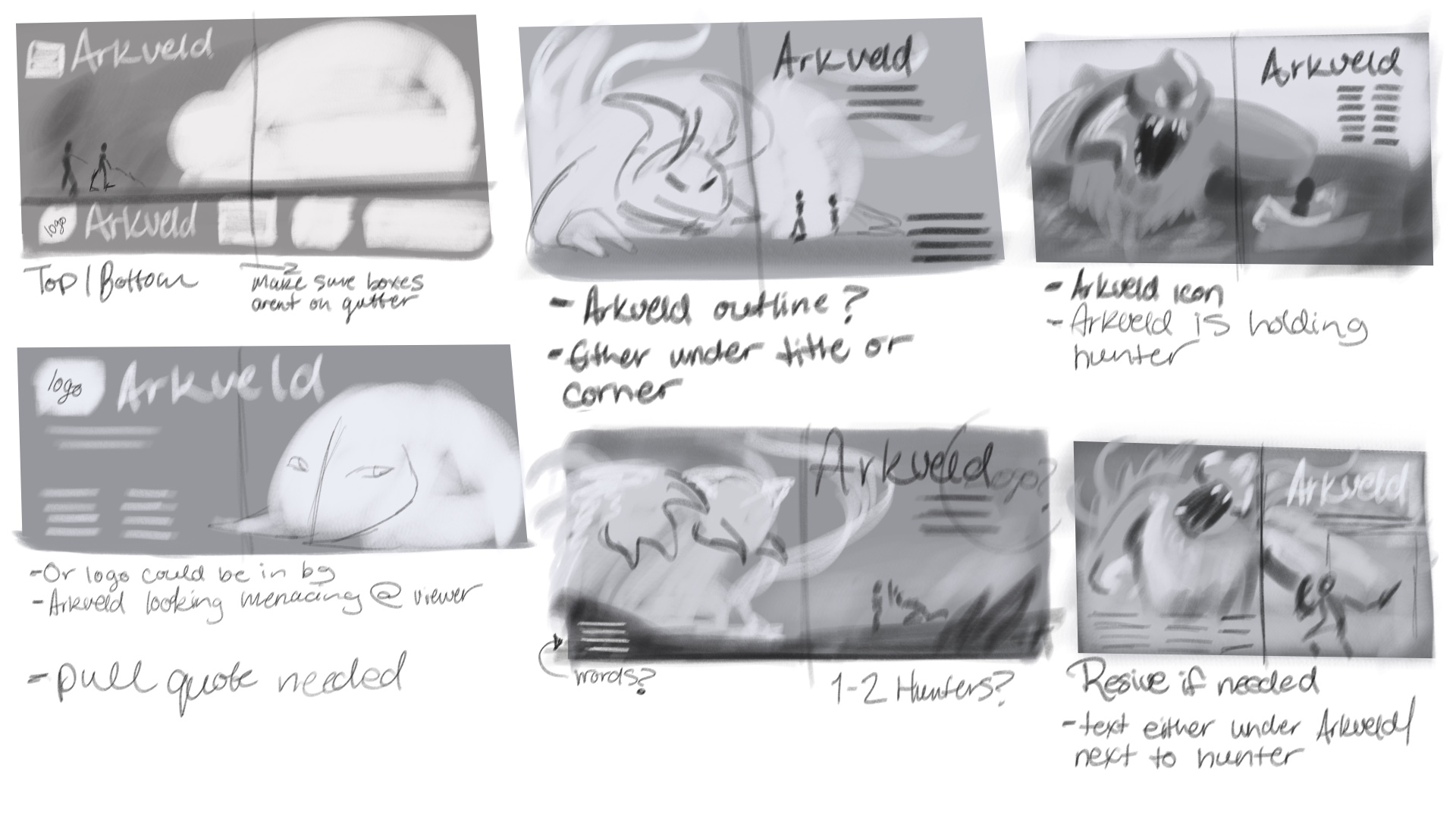
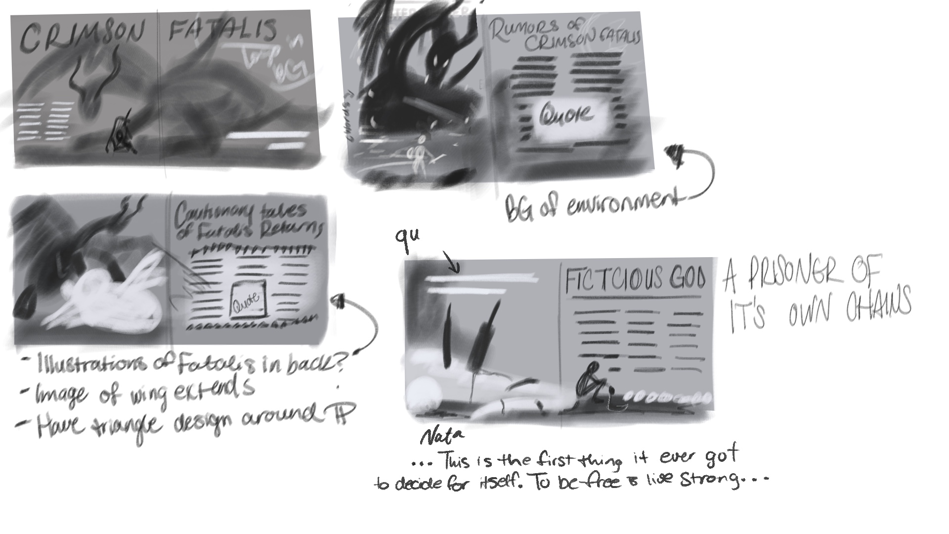
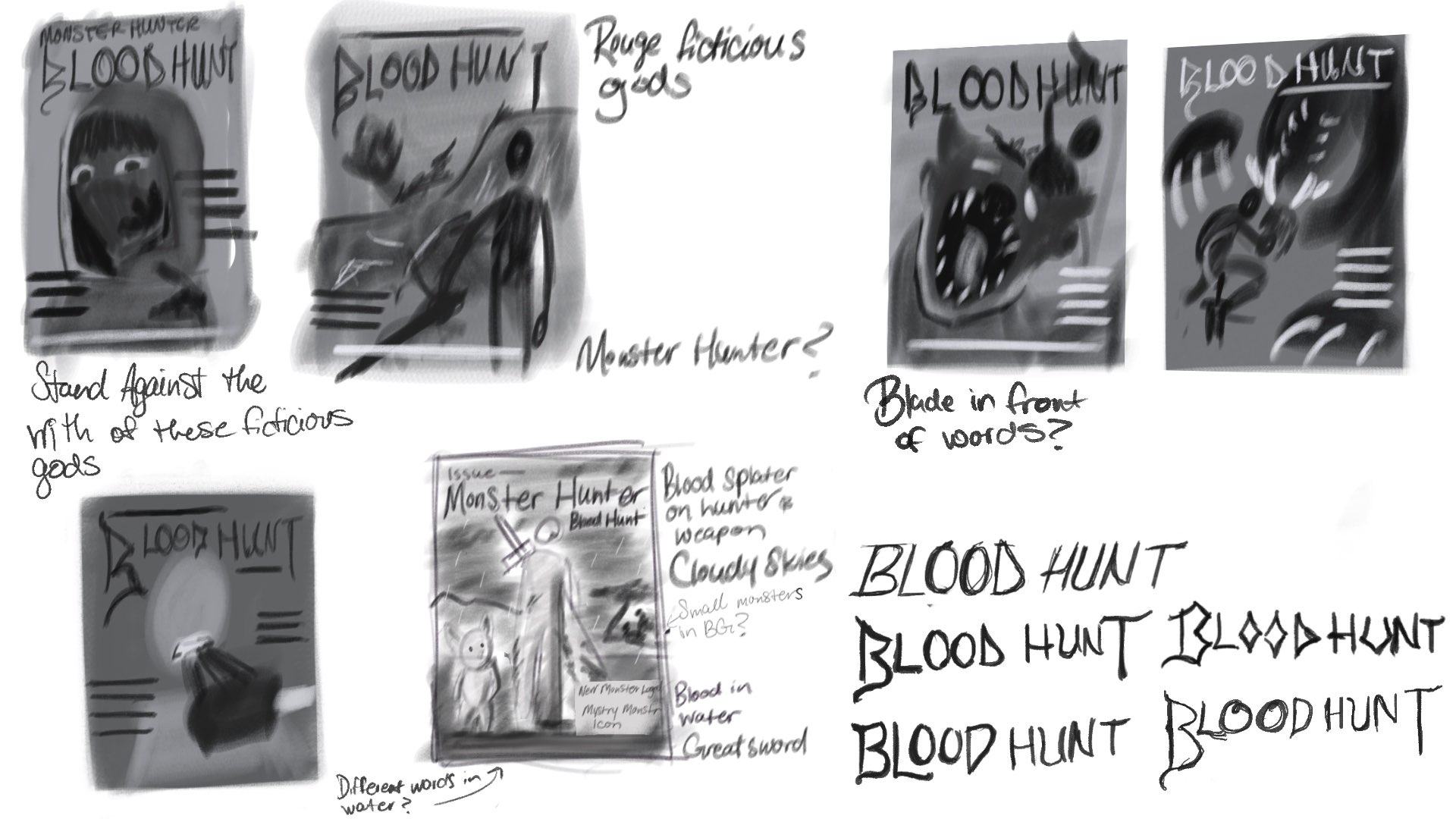
When looking for inspiration, I researched hunting magazines. I noticed that most covers have one person as the focal point at a dynamic angle, and depending on the magazine, they are somewhat camouflaged into the background. However, I was pulled towards the idea of masking the hunter’s true intentions with the Waterfowler magazine. I researched if people also made a similar idea I was planning; I was able to find two, although AI-generated, I took inspiration for how to word the lead articles. When looking at magazine spreads, I liked how the animals focus by encompassing more than half of the spread, and I could use that to evoke curiosity and shock for the monster.
Typography
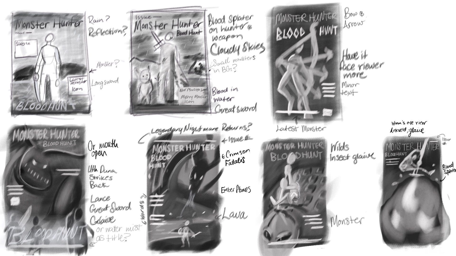
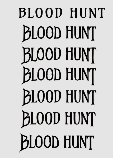
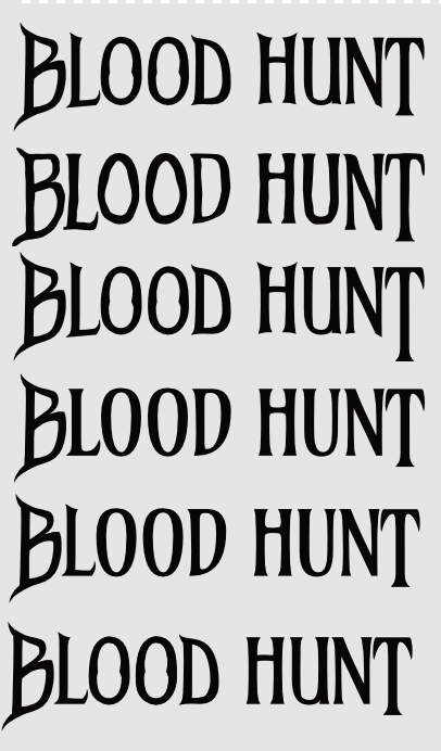
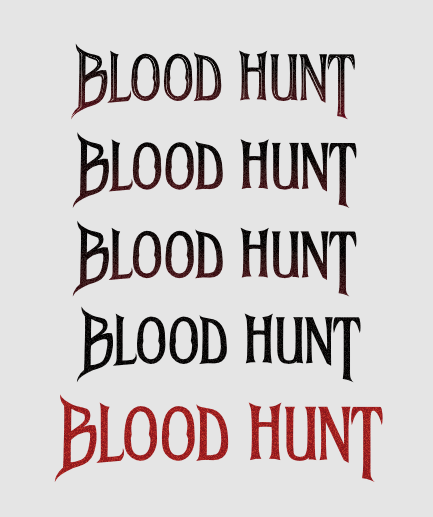
The masthead takes inspiration from Monster Hunter Wild’s main and DLC game titles, so I first sketched some title ideas, then edited the font, Amarante, to give the serifs a sharper and more dangerous look. I tested different textures and gradients, but a red font with subtle noise texture gave the best and most readable look. For the lead articles, I kept a fancy fantasy theme while not making the font overpower the masthead.
Illustration
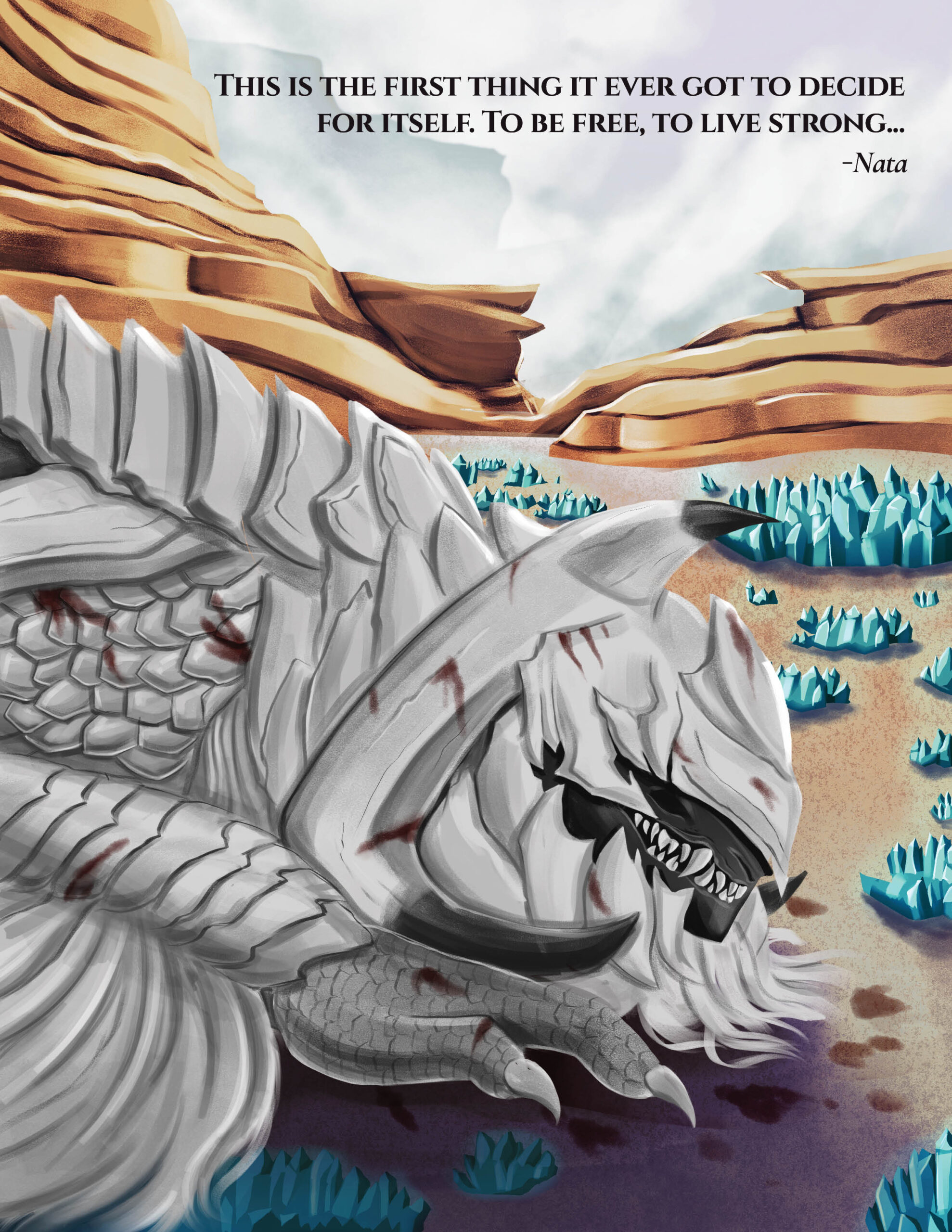
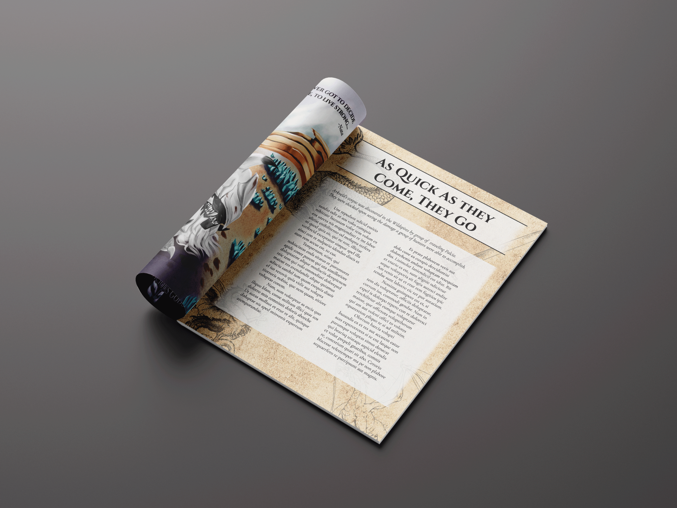
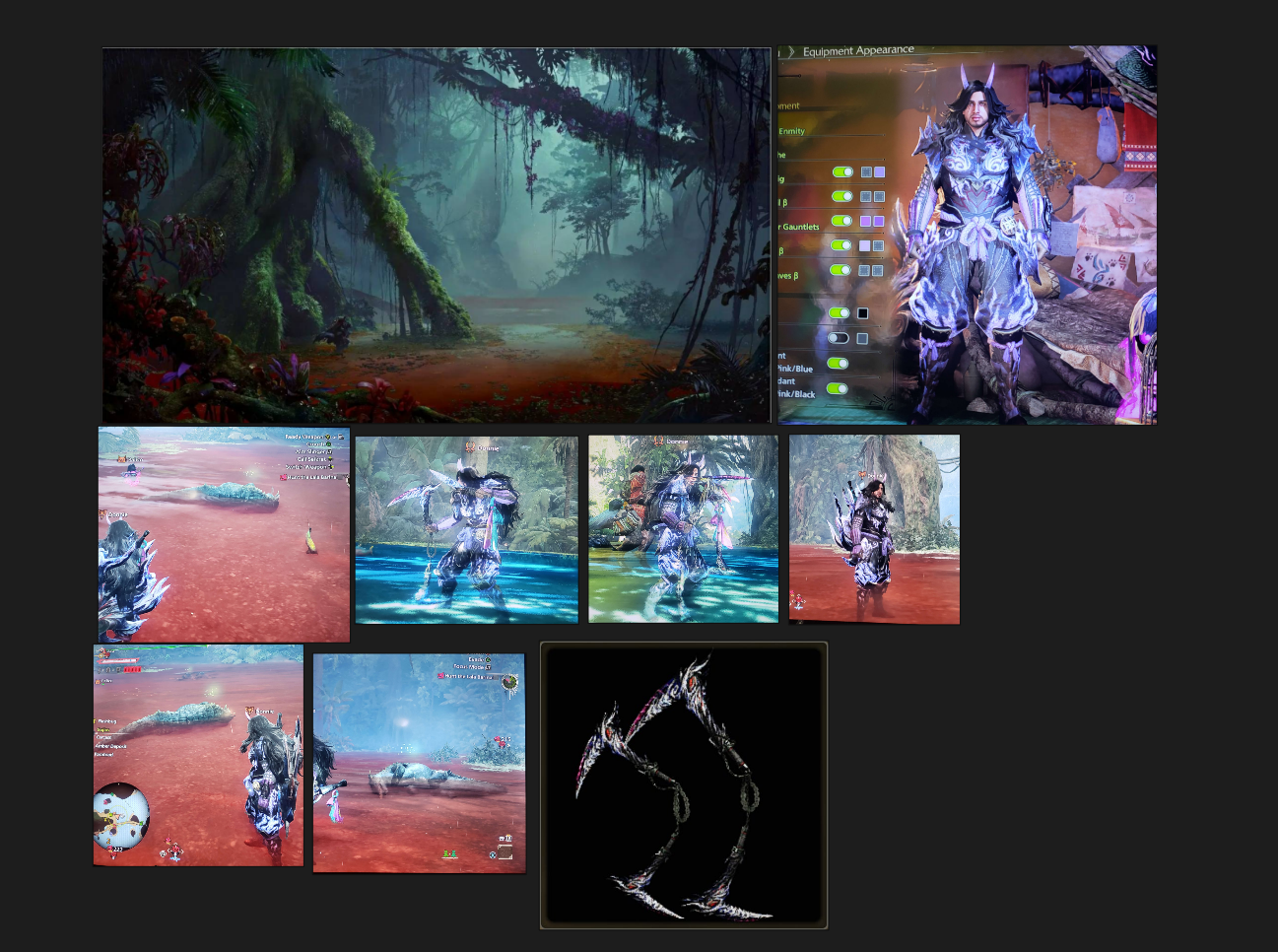
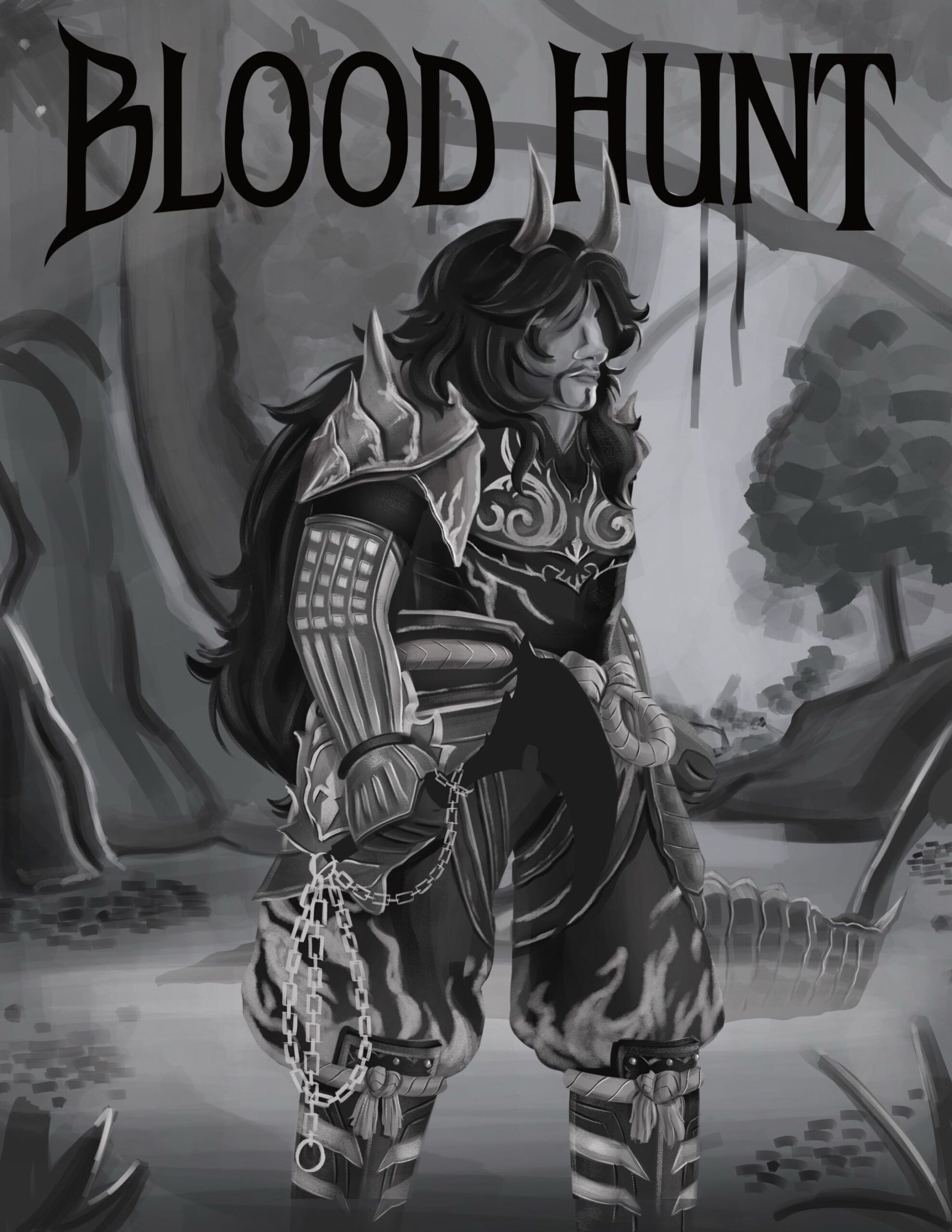
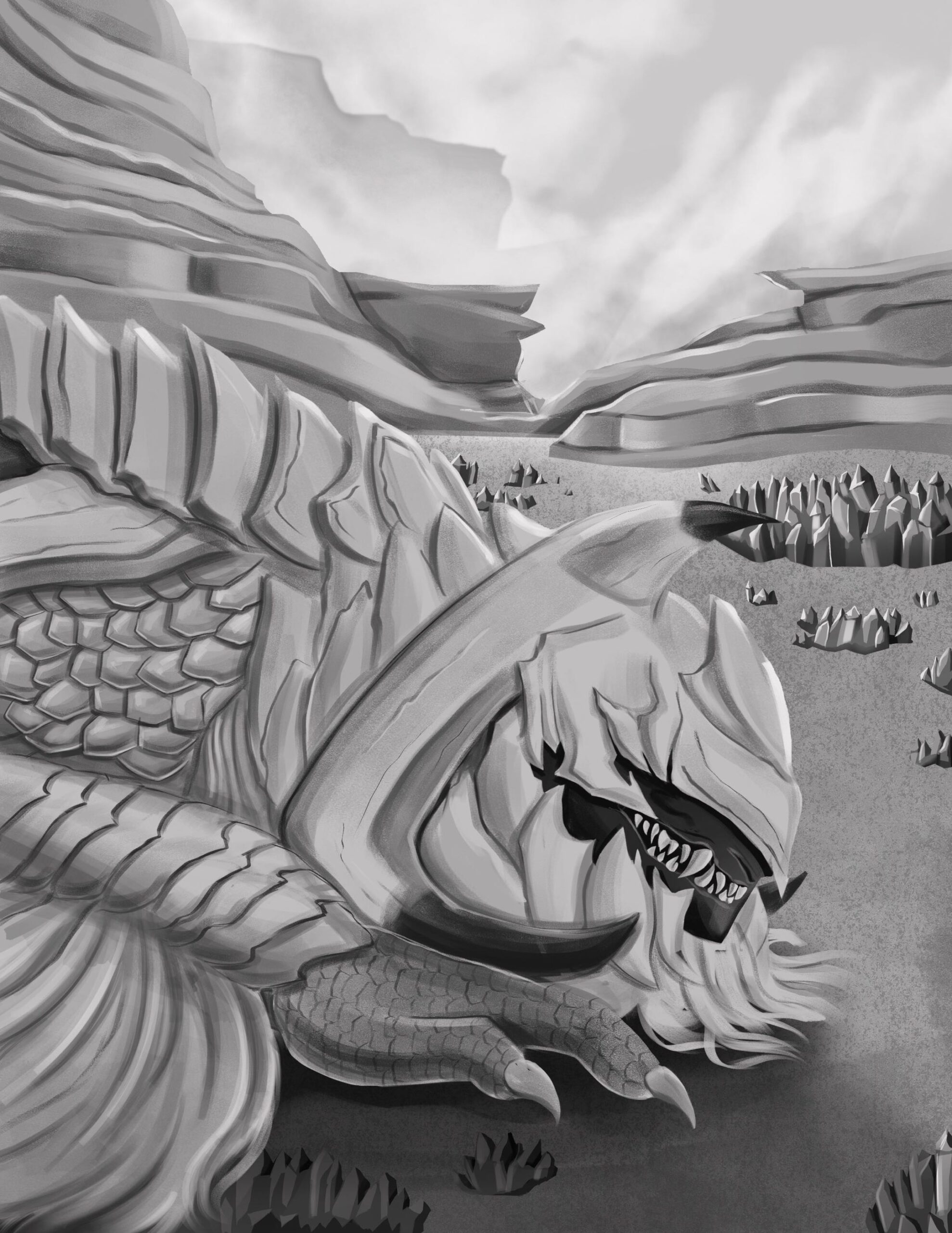
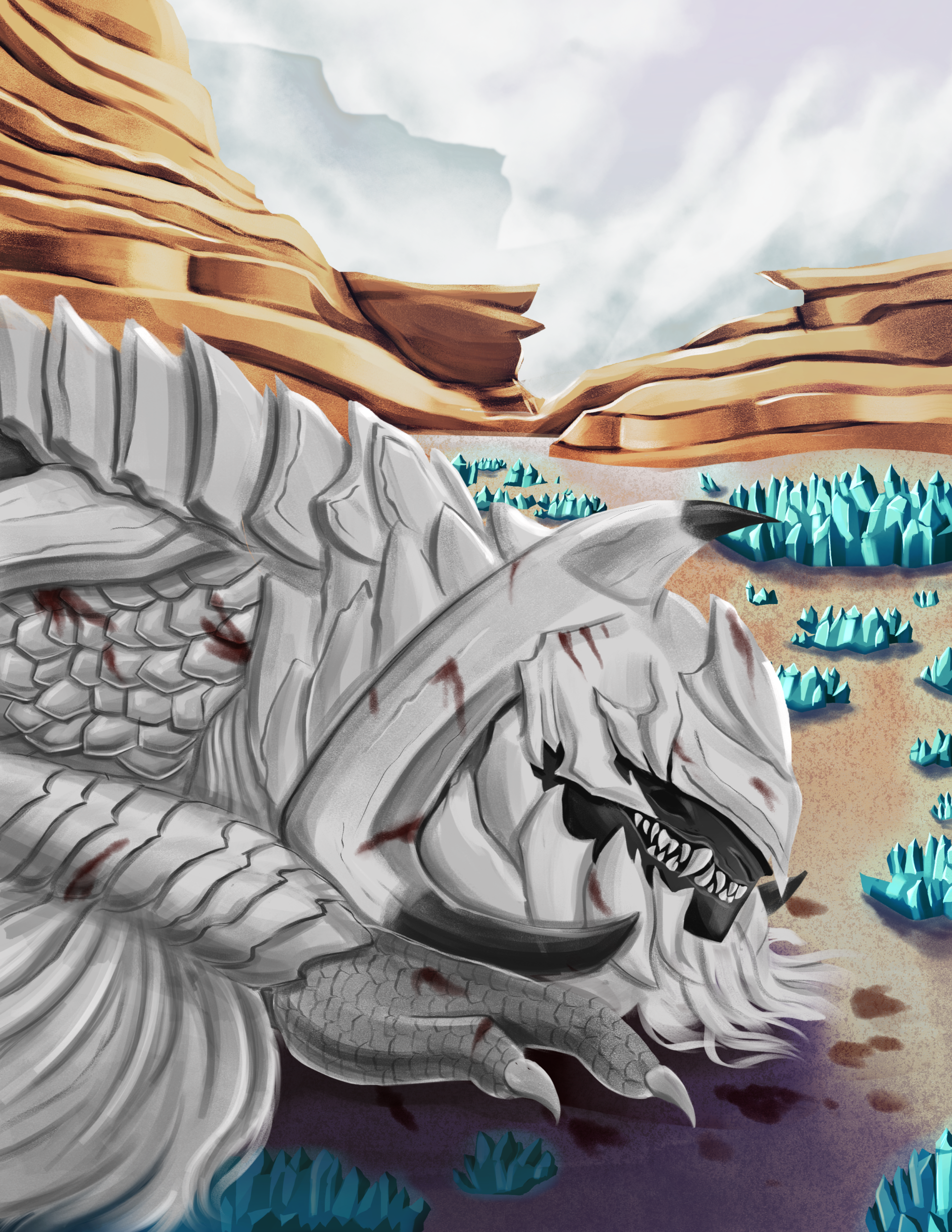
When creating the cover and the spread, I went into the game to get background, monster, and character references. I also found some official art of the Scarlet Forest, the location on the cover. For the spread, Arkveld, the main monster in Wilds, lies dead in the Wildspires. I drew in grayscale first to focus on values and focal points, then glazed the illustration in color. The main challenge was keeping the focal point’s proportions accurate while maintaining high quality. I had a week to finish the cover, but I only had three days to finish the spread. Because I wanted to keep Arkveld, the final monster in the main story, in focus, I was able to get rid of some elements, like Hunter Oliva. However, this enhances the feeling of intensity of the illustration, giving the impression of disregarding a monster’s life.
Editorial Design
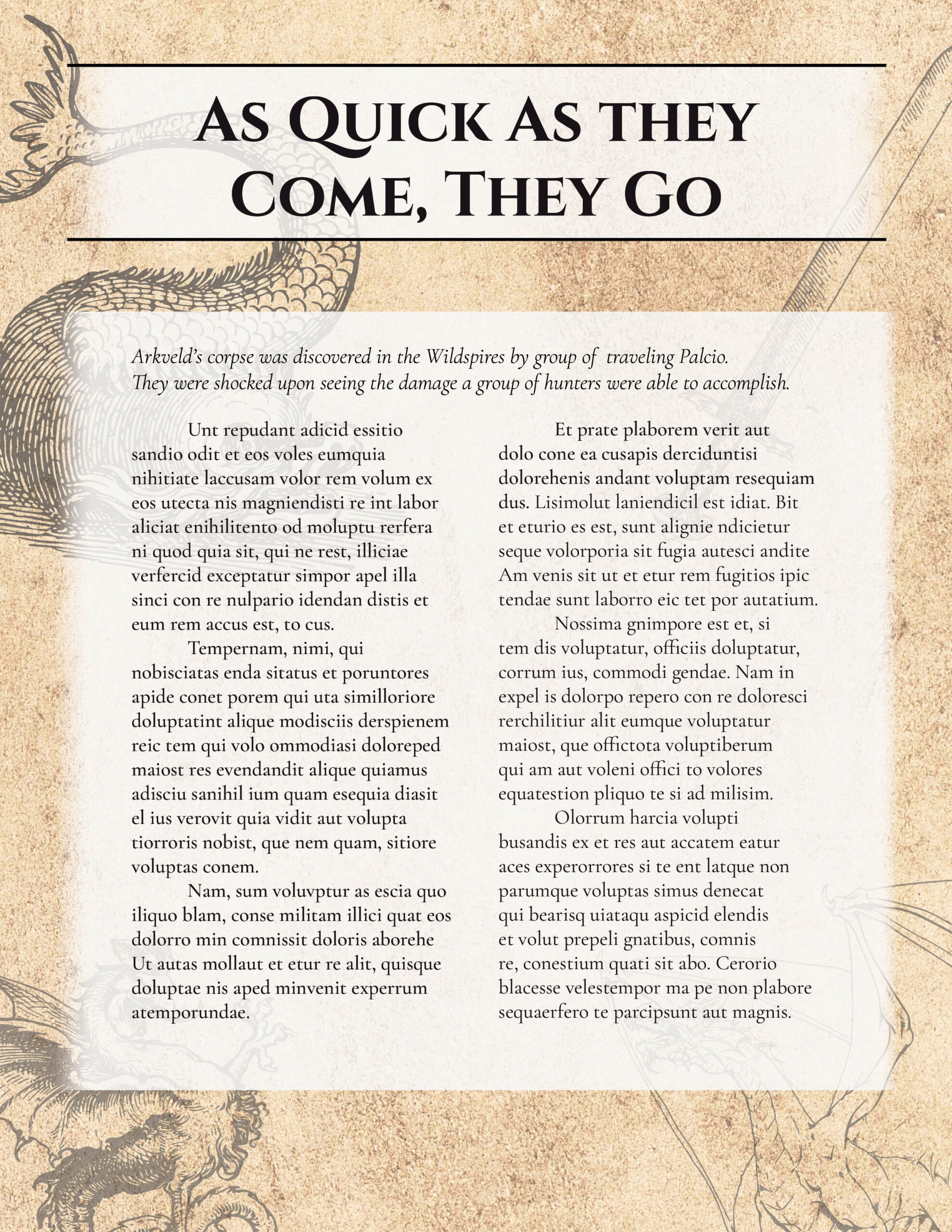
It was challenging to make the font legible while making sure there were no tangents with elements. To keep titles like “Nothing but Fictitious Gods” and “Monster Hunters,” I added a drop shadow and bezel, not only to make it legible but also to be the next text the reader sees after looking at the hunter and masthead. For the right page of the spread, I wanted to replicate the hunter’s journal; they have a lot of paper textures with illustrations of the environment. Keeping with the theme of monsters, I got Monster illustrations and paper textures, and added some white faded boxes between the text in the background to make it legible for the readers.